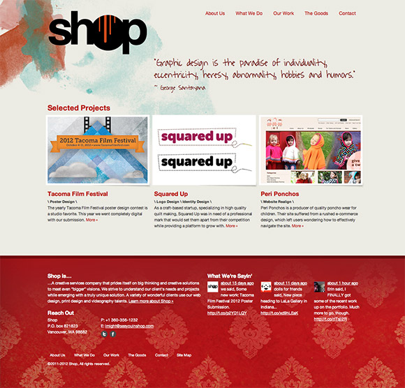
To say that releasing this, the second version of the shop site was an enormous undertaking would be a bit of an understatement. Much the same as when our first site went live a few years ago, we struggled to get this one out the door.
At the time of the first incarnation of the site gradients and heavy textures were in. It was considered good practice to utilize interface elements that mimicked the tactile nature of the real world and everyone was immersed in folding edges, digitally replicated tape, ribbons, and other practices that are now surely considered nefarious practice–or at the very least, good ol’ fashioned skullduggery.
Being designers, fine artists and writers, we embraced this ideal at the time with all the un-abashed love we could muster. It was a texture fest revealing the intersection of handmade and technical work that we were are interested in doing. Our architecture at the time was crude by what I perceive our standards to be now, but again, it was modeled according to the times. It was our first site, and we loved it dearly–warts and all.
What I’ve learned during the process of crafting two versions of our studio’s site is that designing for ourselves is hard. Much of the determination, clear thinking and solid strategy that we employ in all of our client work comes much harder when we are the focus of the project. But it stands to reason. We all tend to raise the scrutiny level when we place ourselves under the microscope. We want the best, but it seems we have to drag ourselves to it kicking and screaming.
Designing for the web is hard. I’m the first to admit it. To practice as an interactive designer during this time is both exciting and rewarding. It is also confusing and divergent. The amount of technology and technique that we are required to understand and keep up on is tremendous. It’s also growing daily. And that creates a self-imposed level of pressure to reflect the bleeding edge of modern practice in the site that represents the work we do. Drawing that line in the sand proved to be one of our major sticking points. In the end it required us to change the way we think about website design.
Designing for the web is hard. I’m the first to admit it.
We’ve tried to embrace the idea of a truly fluid web and have adopted an iterative, evolutionary approach with this site. We have come to view this site as an ongoing project. We launched with our minimally viable project (to put it in agile terms), and we are building on to it brick by brick. Once we finish, we will re-assess and begin to set in on a series of constant changes allowing the site to evolve. We view this collection of code, pages, images and content as a member of our team, and as such, it needs to experience consistent change just as we do in order to reach its our full potential.
- - -by Erin Lynch // Thoughts, Web Design